How to design a book cover that sells
A book cover does not need to explain the whole story. It needs to make the right reader stop long enough to take a closer look. Most of the time, that happens at thumbnail size on a crowded screen, not as a full-size image.
You do not need to be a professional designer to make a strong cover, but you do need to understand what the cover is being asked to do.
What a cover needs to do
A book cover has three jobs:- Signal genre. Before a reader processes the title or author name, the cover’s colors, typography, and imagery tell them what kind of book this is. Romance covers look different from thrillers, which look different from literary fiction. Readers make these associations instantly and unconsciously.
- Stand out at thumbnail size. Most book discovery happens on screens. Your cover needs to stay legible and interesting when it is very small.
- Convey quality. A professional-looking cover tells the reader that the writing inside has been treated with the same care. An amateur cover raises doubts, fair or not.
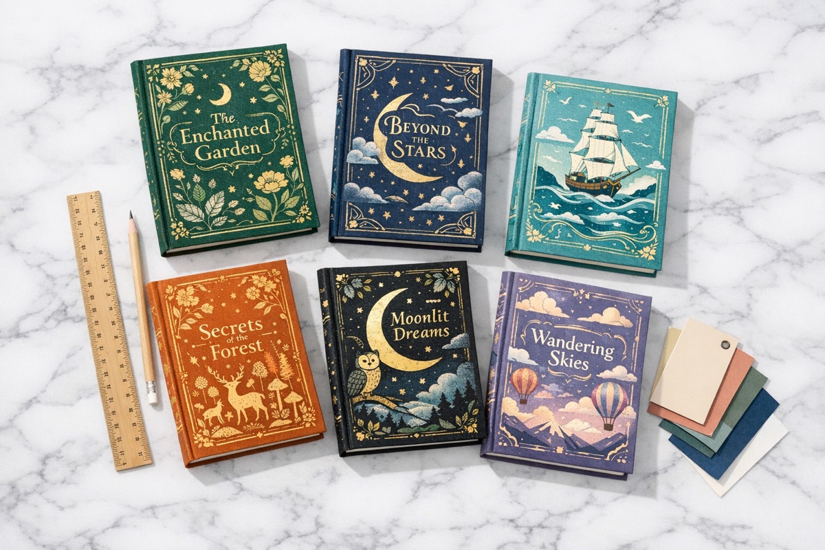
Anatomy of an effective cover
Typography
The title is usually the most important visual element on a cover. The font needs to fit the book you are selling:- Serif fonts (like Garamond or Baskerville) suggest literary fiction, historical, or classic tones
- Sans-serif fonts (like Futura or Helvetica) feel modern, clean, and contemporary
- Display fonts (decorative or hand-drawn) can signal specific genres like fantasy, horror, or romance
Color
Color sets mood quickly:- Dark backgrounds with high-contrast text suggest thriller, mystery, or horror
- Warm tones (golds, reds, oranges) suggest romance, historical fiction, or literary warmth
- Cool tones (blues, silvers, whites) suggest sci-fi, contemporary, or cerebral stories
- Bright, saturated colors suggest young adult or upbeat commercial fiction
Imagery
Keep it simple. One strong image is usually better than a crowded collage. The goal is not to illustrate the entire plot. It is to suggest tone, tension, or atmosphere.Many successful covers use no imagery at all, relying on type and color instead. That can work especially well for literary fiction and nonfiction.
Common mistakes
- Too much text. Title, subtitle, author name, tagline, blurb, series name, it adds up quickly. Prioritize hard.
- Low-resolution images. Blurry or pixelated cover images look unprofessional. Use high-quality source material.
- Ignoring genre conventions. Originality is good, but if your thriller cover looks like a romance novel, you’ll attract the wrong readers and repel the right ones.
- Designing for print but forgetting digital. Always check the cover as a thumbnail. That is where most readers will first see it.
Designing your cover with Plotten
Plotten includes a built-in cover designer, which is useful if you want to keep the cover work close to the manuscript:- Start with your canvas. Set your cover dimensions to match your target platform’s requirements.
- Add your title and author name. Position and style your typography. Experiment with font size, weight, and placement until the hierarchy is clear.
- Add imagery or keep it typographic. Import images or create a typography-only design. Adjust colors and layout until the mood is right.
- Preview at different sizes. Check how your cover looks both full-size and as a thumbnail. Make sure the title remains readable at small sizes.
- Export. Include the cover when you export to EPub, or export it separately for retailer listings.
When to hire a professional
If your book is commercially important to you, if you are launching into a competitive genre, building a series brand, or putting money behind promotion, a professional designer is often worth hiring. They bring experience in typography, composition, and genre positioning that is difficult to fake on a first attempt.For early editions, side projects, or writers who genuinely enjoy the design side, doing it yourself can still make sense. The important part is restraint. Study the covers that work in your genre, then make clear choices instead of adding everything at once.
Plotten is available on the App Store if you want to design the cover alongside the manuscript.

